Styling a Landing Page with CSS - Part 1

This is my first full article on hashnode 😄, so feel free to criticize my choice of words.
I am starting a series where I would build pages and document my process to practice my HTML, CSS, and JavaScript skills and also get better at technical writing.
I have divided this project into two parts. The second part would be published soon.
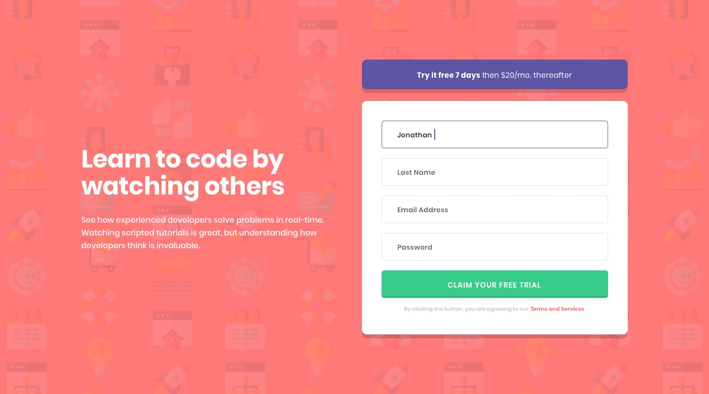
Intro Component with Sign Up Form
I selected this challenge from FrontendMentor. This project caught my fancy because it requires the use of JavaScript to implement form validation which is pretty new to me.
Problem Statement
The challenge
Users should be able to:
- View the optimal layout for the site depending on their device's screen size
- See hover states for all interactive elements on the page
Landing Page with HTML and CSS
My process
I had to implement the page design with responsiveness for both mobile (375px) and desktop (1440px) screens.
This project was built with the following concepts:
- Semantic HTML5 markup
- CSS custom properties
- Flexbox
- CSS3 Rules - Media Queries for Responsiveness
- Mobile-first approach
 My Approach
- I started implementation with a mobile-first approach which I learnt while taking the Udacity Frontend Web developer nanodegree.
- With the Style guide file provided, I imported the font via the CSS import rule. The file also contained colour details.
@import url('https://fonts.googleapis.com/css2?family=Poppins:wght@400;500;600;700&display=swap');
- For mobile screens, the elements were to be stacked in a simple vertical layout

- For the desktop screens, the layout is a bit different. So I made use of the CSS Flexbox .
- Note: there were separate background images for the two orientations
@media(min-width: 768px) {
    .container {
        background: url('../images/bg-intro-desktop.png') hsl(0, 100%, 74%);
    }

    #main {
        display: flex;
        flex-direction: row;
        align-items: center;
        justify-content: center;
    }
}
Difficulties
- Responsiveness took some time.
This was when I really appreciated doing a mobile-first design, which is easier to see changes more evident on resizing.
I adjusted styling for the buttons and form input properties severally. I added a different style for a larger screen orientation to the call-to-action button.
@media(min-width: 900px){
    .call-to-action-btn {
        padding: 1rem 4.8rem;
    }
}
- The footer either extended beyond the page or was less. I corrected this by removing the width property I had set earlier.
Takeaways - What I learnt
- I got to improve on working with background images in CSS
- I made good use of CSS Flexbox.
- Finally, I learnt how to style a form for validation purposes, for example, styling principles: using red colour to indicate an error with input, etc.
You can view my solution at Live Site and the code in the repository.
Follow me on GitHub and Frontend Mentor
